We often get the same question with
“I’m new, what distro do you recommend?”
and I think we should make a list/ discussion on what is our pick for each person, and just link that post for them to give them an easy recommendation.
So I made a quick flow chart (will get polished as soon as I get your input) with my personal recommendations. It is on the bottom of the text, so you see the rest of the text here too.
I will also explain each distro in a few, short sentences and in what aspects they do differ and what makes them great.
Here are my “controversial” things I want to discuss with you first, as I don’t want to spread nonsense:
Nobara
I don’t know if we should recommend it as a good gaming distro. In my opinion, it’s a highly insecure and experimental distro, made by one individual. I mean, sure, it gives you a slightly better experience ootb compared to vanilla Fedora, but:
- As said, it’s made by one single guy. If he decides to quit this project, many many people will just stop getting updates.
- There are many security-things, especially SELinux, disabled.
- It’s severely outdated. Some security fixes take months until they arrive on Nobara.
- It contains too many tweaks, especially kernel modifications and performance enhancers. Therefore, it might be less reliable.
I think, Bazzite is the way superior choice. It follows the same concept, but implements it in way better fashion:
- Just as up-to-date as the normal Fedora, due to automatic GitHub build actions.
- No burden of maintenence, either on the user or the dev side.
- Fully intact security measures.
- And much more.
Immutable distros
I’m a huge fan of them and think, that they are a perfect option for newcomers. They can’t brick them, they update themselfes in the background, they take a lot of complexity compared to a traditional system, and much more.
Especially uBlue and VanillaOS are already set up for you and “just work”.
If you want to know more about image-based distros, I made a post about them btw :)
VanillaOS
It’s the perfect counterpart for Mint imo. It follows the same principle (reliable, sane, easy to use, very noob friendly, etc.), but in a different way of achiving that.
The main problems are:
- The team behind it isn’t huge or well established yet, except for the development of Bottles.
- They want to do many things their own way (own package manager, etc.) instead of just using established stuff.
- The current release (V2, Orchid) is still in beta atm.
I see a huge potential in that particular distro, but don’t know if I should recommend it at this point right now.
ZorinOS
I think, for people who don’t like change, it’s great, but it can be very outdated. What’s your opinion on that distro? It looks very modern on the surface and is very noob friendly, but under the hood, very very old.
Pop!_OS
Same with that. Currently, there’s only the LTS available, since System76 is currently very busy with their new DE. I don’t know if we should recommend it anymore.
I made the list of recommendations relatively small on purpose, as it can be a bit overwhelming for noobs when they get a million recommendations with obscure distros.
Do you think that there are any distros missing or a bad recommendation?


Ah shit, I’m 13.
Removed by mod
Thanks for the feedback!
I’m sorry if that’s harsh, but my feedback would be: drop that chart!
It’s daunting, it’s going to freak out many newbies. Too much choice kills the choice.
You have one “default” at the bottom, Mint, so stick to that. Tell the newbies they can switch anytime to something else once they’re a bit more comfortable with the Linux-world. And if I’m not mistaken, you can install and try the main DEs with Mint also. Or you can recommend Ubuntu, or any other newbie friendly distro. Just pick one and don’t lose them over what they could see as an important difficult decision before they even get started.
Don’t drop the chart! It’s really helpful for some people, and it’s fun, even for people who are looking to branch out rather than start fresh.
Maybe have it start simple, eg. the very top choice is “First distro?” and Y points to a giant friendly MINT endpoint that takes up half the real estate, then N points to the regular cloud of options.
But don’t ignore the benefits of graphical representations. If newbies make it all the way here, they’ve already waded through hundreds of vast, incomprehensible walls of text expounding the virtues of sysv and runit.
I’m not saying dumb it down. There’s plenty of time to dig deeper, let’s ease the initial option paralysis.Yeah this was my thought exactly.
Use ubuntu unless you know why you prefer something else.
Are we still recommending Ubuntu though
Mint. Which is based on Ubuntu (without all the crap)
Mint Debian please
Depends who “we” is but the more people you include, the more it trends to “no”.
I don’t have any specific beef with your chart but I do feel like we sometimes do a disservice to newbies by focusing on distros rather than the main desktop environments and what differentiates them. I wouldn’t hesitate to recommend basically any of the Fedora spins or Debian-based distros to beginners.
The choice between KDE, Gnome, Cinnamon, etc. is much more consequential for a new user than DNF vs. Apt (especially in the Flatpak era).
People who think its too complicated won’t make it to the bottom of the flow chart.
tl;Dr needs to go at the top, not the bottom. That’s the point. They won’t make it to the bottom.
Came here to say this too
I feel like this should be more about DE choice than distro.
Yes, I think it should end with a desktop environment (and why it was recommended), and then distros with good support of that DE (with one of them being the recommended distro for that category)
I really like the bottom Linux Mint recommendation tho, I would keep that
This by a long shot, I agree.
- Install debian
- Try some different DEs
- Profit

sorry if this is harsh but this seems like kind of a waste of time when distrochooser.de exists? I think it’d make a ton of sense to link that in the sidebar but a wall of text (or a huge flow chart) is just gonna be skipped by the type of people who are asking what distro to use first instead of researching it themselves anyway. if someone’s asking in a forum like Lemmy or even in discord servers, they usually just want quick answers. if we’re gonna link them something instead of just saying “mint” or whatever, it should at least be something easily digestible like distrochooser.de
A few suggestions:
-
Start with a question of the user’s technical proficiency. This is probably the biggest deciding factor for picking a distro, since some lean heavily toward technically-adept audiences and some are designed for people who’ve never used a computer before.
-
Include questions on device type, such as desktop/laptop. Using Linux on a laptop typically requires more research.
-
Instead of asking about Windows specifically, maybe ask “which OS are you most comfortable with?” with arrows for different versions of Windows, macOS, iOS, Android (and even Linux?).
-
Make every endpoint self-contained and unambiguous, with at least one concrete recommendation. Avoid vague statements like “use what you want”, and avoid referring to other branches of the flowchart. If it makes sense to converge with other branches, use a labelled arrow to point to that branch instead (this will probably require curve support in your design tool to be legible).
-
Write each box in the form of a question, and label the arrows with answers to that question. I honestly have no idea how to read the “gaming focused” box because it has two bullet points and no indication of what each arrow means. I also can’t tell how to read the “general purpose/gaming” box without reading down both paths. And why does the Bazzite box point to popOS? What does this mean? Clearer labels would help.
-
The red endpoints on the left could be in a single box, since they follow the same path. Alternatively, add more questions to that path to meaningfully differentiate each option. Same with the two clusters of blue endpoints on the right.
-
Be more explicit in the terms for use cases, since “general purpose” is a bit vague (I would consider gaming to fall under “general purpose”, myself). You could have paths for e.g. “web browsing and office work”, “gaming”, “media creation”, “software development or scientific computing”. Some of these paths might converge later, and that’s okay.
-
Move the “This is too complicated” box up top. It’s funny and probably more useful there as a kind of “TL;DR”. Since it’s not related to Nvidia, its current placement is odd.
Thank you for your very valuable and helpful criticism!
I like especially your “what OS are you the most comfortable with?”-question, that one is very great!The rest is also very well thought out, I will implement it as best as I can! :)
-

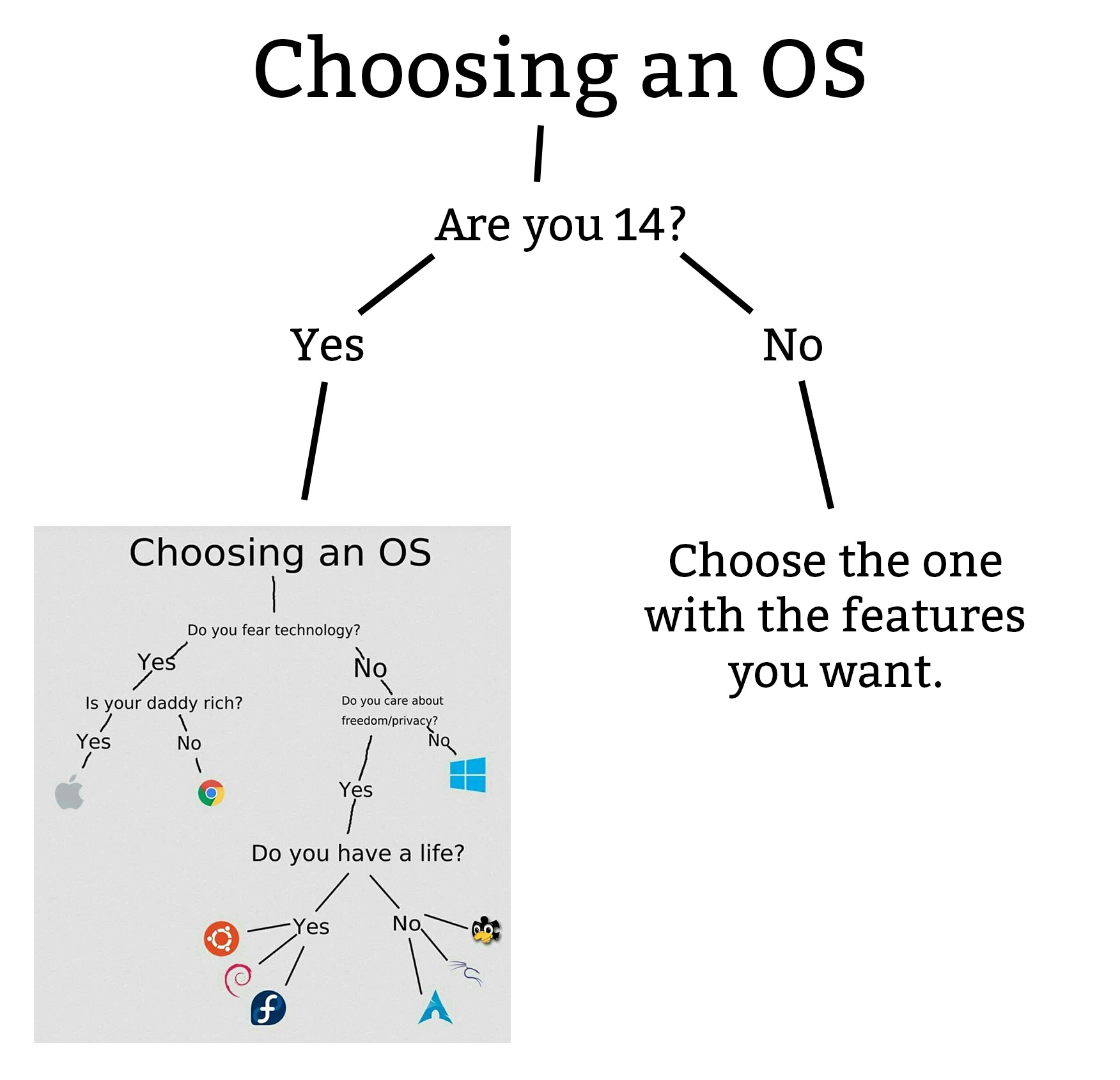
Slight problem with the meme vs what OP is doing: Someone evaluating choices isn’t going to know what to search for from logos. They’ll n only recognize Google, Apple, and Windows, with a slight possibility on Linux distros.
My prefered OS is missing. Must be a bug. Plz add NixOS kthx
Already done in the final version ;) But you won’t be happy, I’ve put it into my “pain”-category :D
Guix > Nix, because I’m more angry about not being able to run the former than the latter.
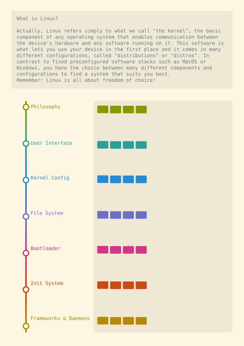
You need to seriously up the contrast on those colors. Pink text on a slightly lighter pink text block is virtually unreadable.
i agree, my eyes are pretty good, but this is not useable. funnily enough my chosen lemmy frontend (alexandrite) would fix the colors, but its too small to read; and when you open the image in a new tab to zoom in, the colors are unuseable.
The graph was just a quick sketch in my note-taking app Logseq.
I mainly wanted to know if the flowchart made sense. When I do it properly, I’ll use a different software :)
I’ll let you know if it makes sense when I can read it 😁
Right now this is literally what I see:

I’m very sorry! This is just a sketch for discussion, the final version will look WAY better and be more legible :)
Ohh no apology needed. I think doing it as a flow chart is a good idea. I just included the screenshot to make sure there wasn’t something going on where the colors were different for you vs everyone else.

Never SuSE again. #UnitedLinux
You need to limit the options.
Linux systems
-
Debian (stable, almost no bloatware, user unfriendly, apt)
-
ArchLinux (unstable, bleeding edge software, user unfriendly, pacman)
-
RHEL/ Fedora (semi-stable, newer software, relatively user friendly, dnf)
Then at max list 3 Systems that derive from each main OS.
Like
Debian: Ubuntu, Mint, PoP!OS ArchLinux: manjaro… Fedora: Nobara…
Where each should be user friendly to use. Also explain what stable means, like that unstable doesn’t mean shit breaks on a regular basis but rather it can sometimes happen. Normal desktop users don’t need the stability of Debian. But it is nice to have if you can live with outdated software (if it isn’t already on flatpak).
-
What do you think about something like this? It’s more of a “build your own sandwich” approach.


